

A Brand For Quiet Confidence
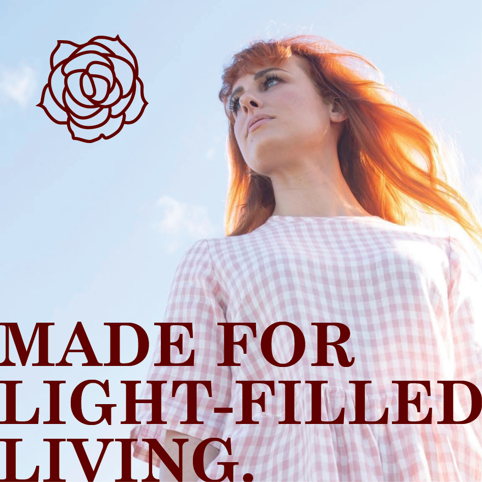
The founder came to me with a name: Rosetint, and a vision: to build a sustainable clothing brand that reflects a mindset of optimism, grace, and ease. The timeless garments are all handmade from natural fabrics in Gisborne, New Zealand, designed to feel as effortless as they are enduring.
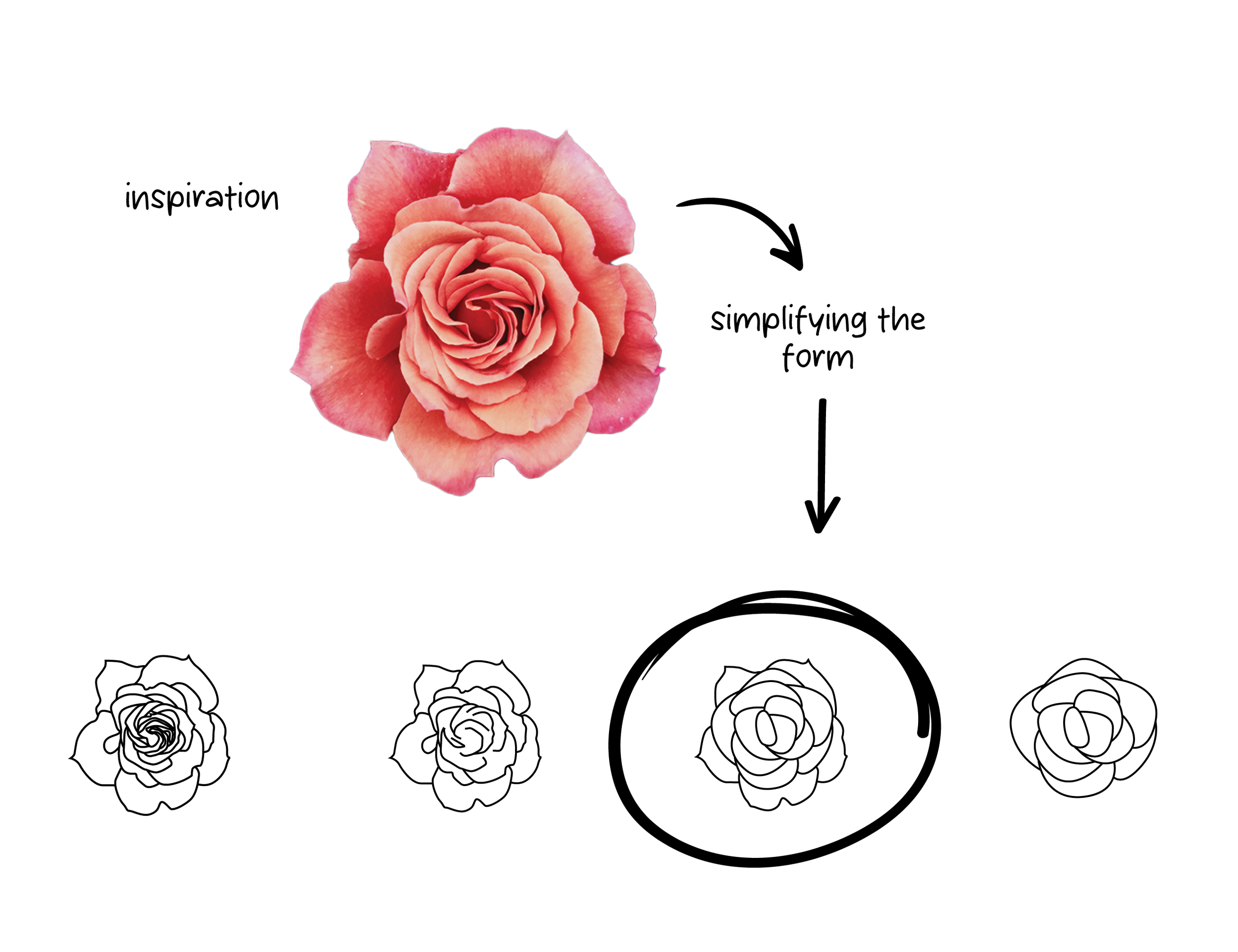
The Challenge: The only design brief? Create the “perfect” rose. The identity needed to feel refined and gentle, without losing clarity or modern appeal.
Design Formula
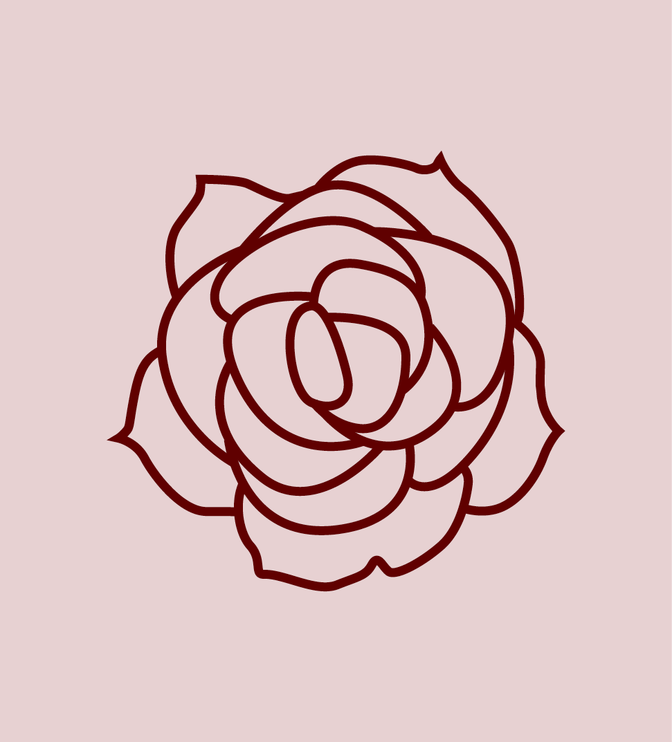
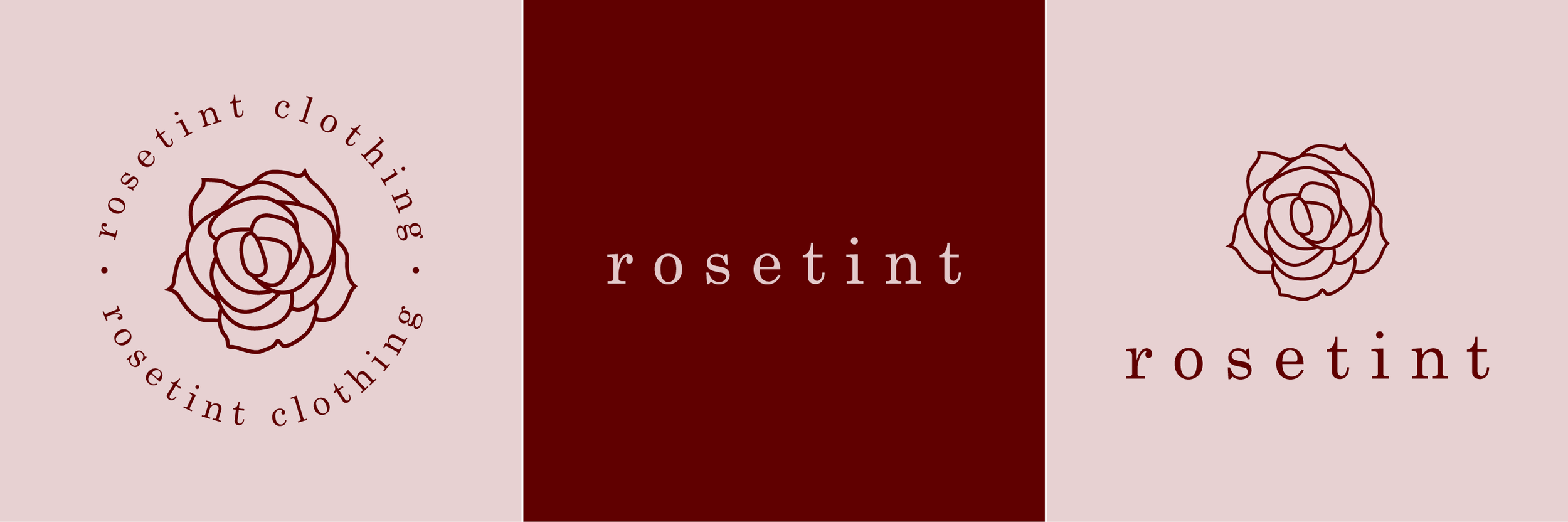
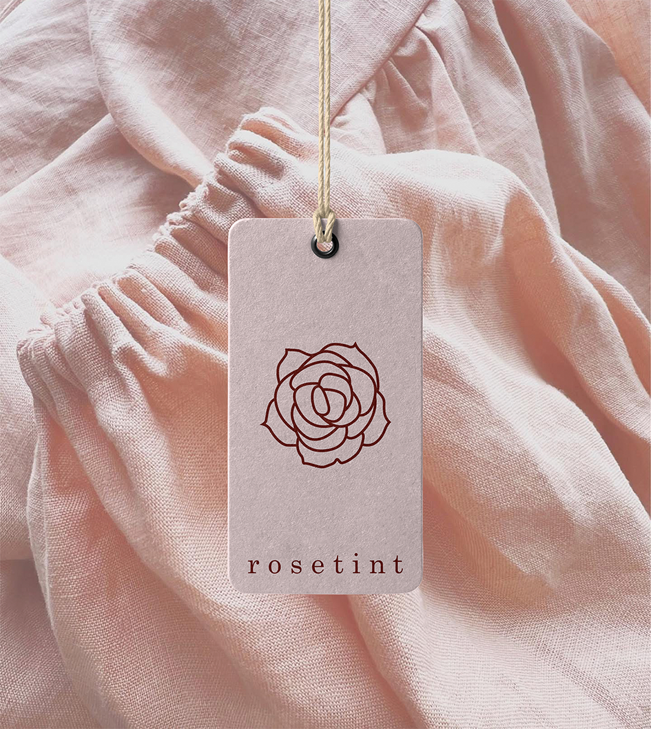
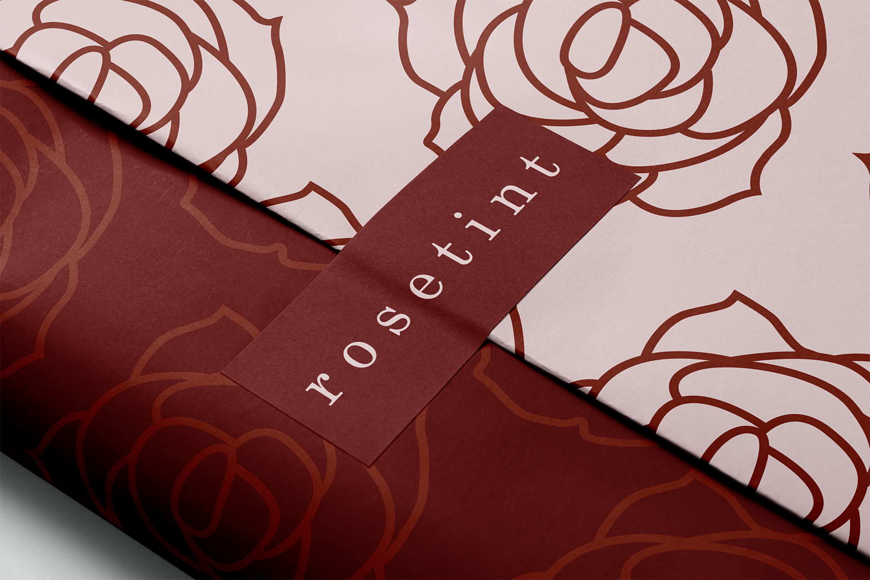
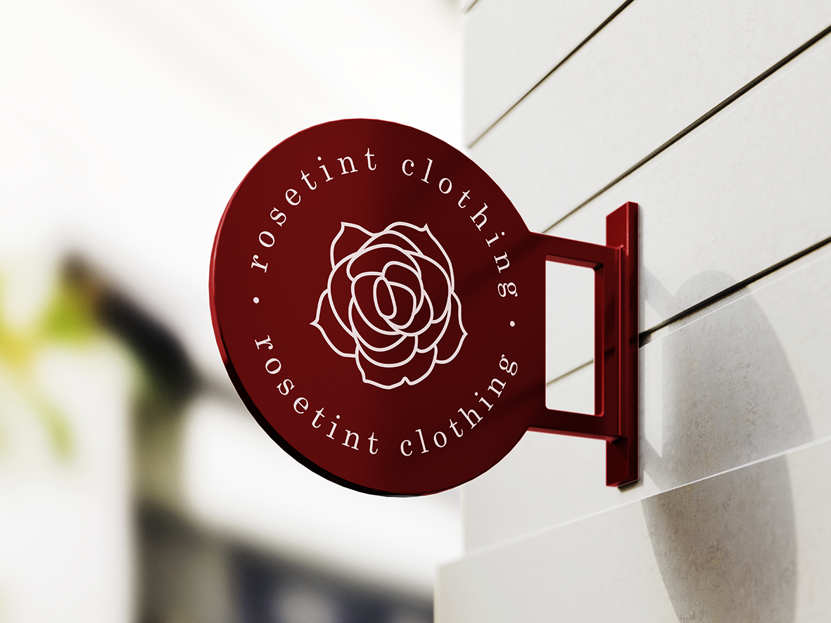
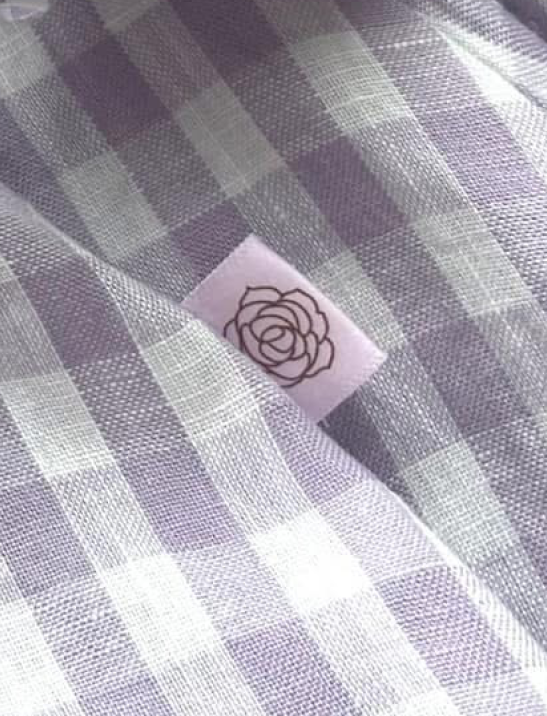
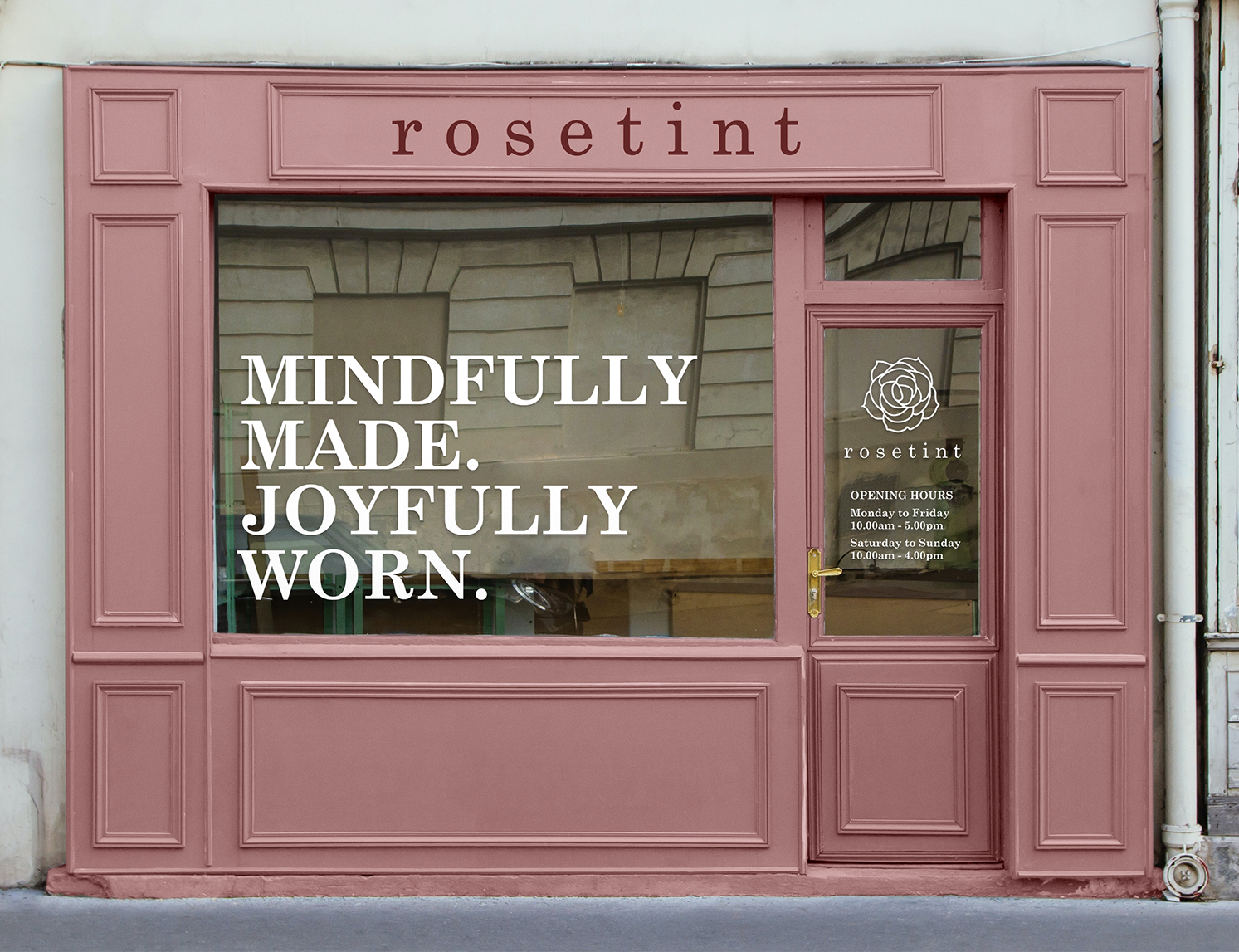
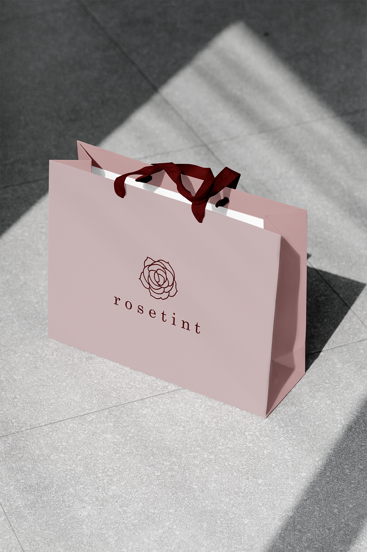
I began with the rose, distilling it into a simplified, elegant line drawing that captures the spirit of the brand: feminine but not fussy, graceful but grounded. Perfectly imperfect. Paired with timeless typography and a warm, restrained palette, the logo feels both classic and fresh, mirroring Rosetint’s design ethos.
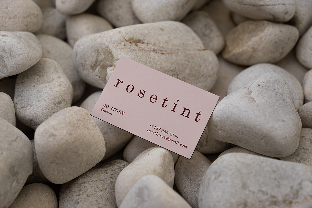
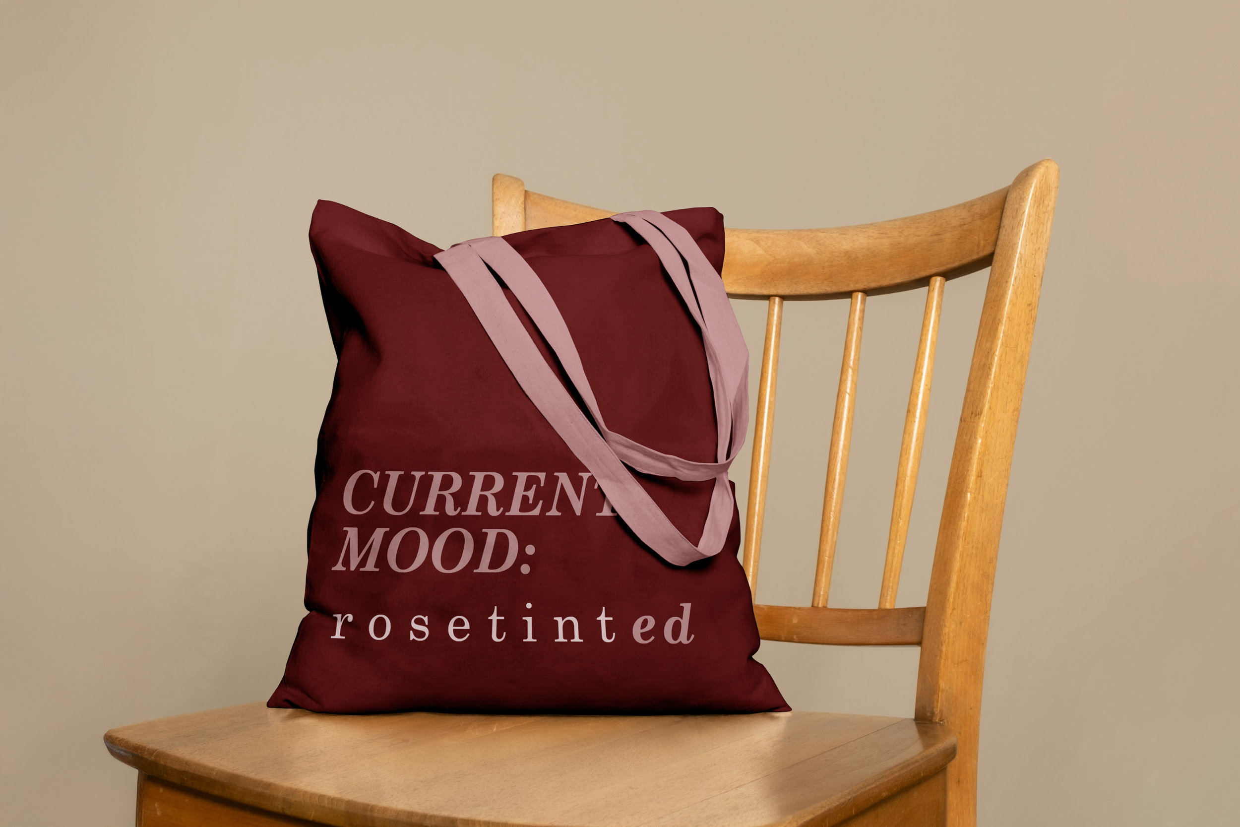
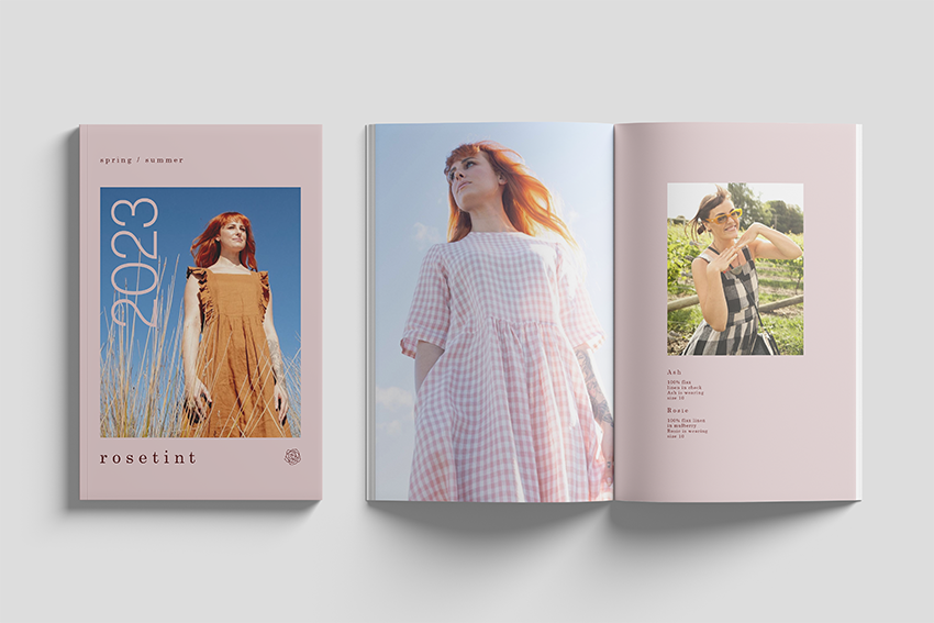
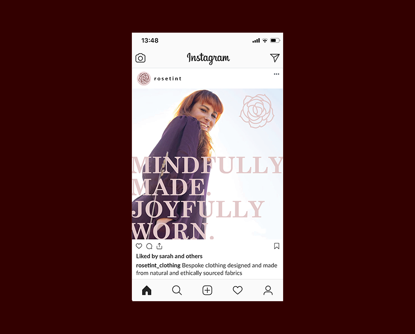
The visual identity extended across a full suite of stationery, signage, packaging, and marketing material, supported by a comprehensive brand guidelines document. Every item is designed to express comfort, confidence, and care, whether it’s a swing tag or a shipping label.
Rose-tinted
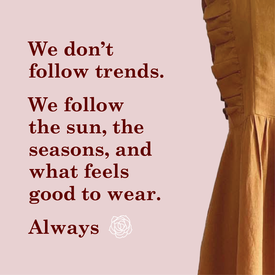
The identity is inspired by the brand’s home: sunny, coastal Tairāwhiti; and by the idea of seeing the world through a rosy lens. It evokes warmth, ease, and slow moments. This is a brand that doesn’t chase trends; it follows the seasons, the sun, and what feels good.
StoryLab Results
The result is a brand that feels instantly familiar and deeply personal. An identity that wears as effortlessly as the clothes it represents. Rosetint’s quiet elegance now has a visual home to match its philosophy.