Kiwis Can Fly
As Head of Visual Identity & Design at the New Zealand Defence Force (NZDF), I led the visual evolution of one of Aotearoa’s most respected institutions. Over a 18-year career, I was responsible for shaping, maintaining, and evolving the brand identities of the NZDF and its three services: Navy, Army, and Air Force.
The Challenge: In an organisation as large and diverse as the NZDF, maintaining a consistent, meaningful, and flexible visual identity is no small task. The challenge was to balance tradition and legacy with modern relevance, while creating design systems that could be applied across thousands of communication touchpoints, from military recruiting campaigns to internal values rollouts.
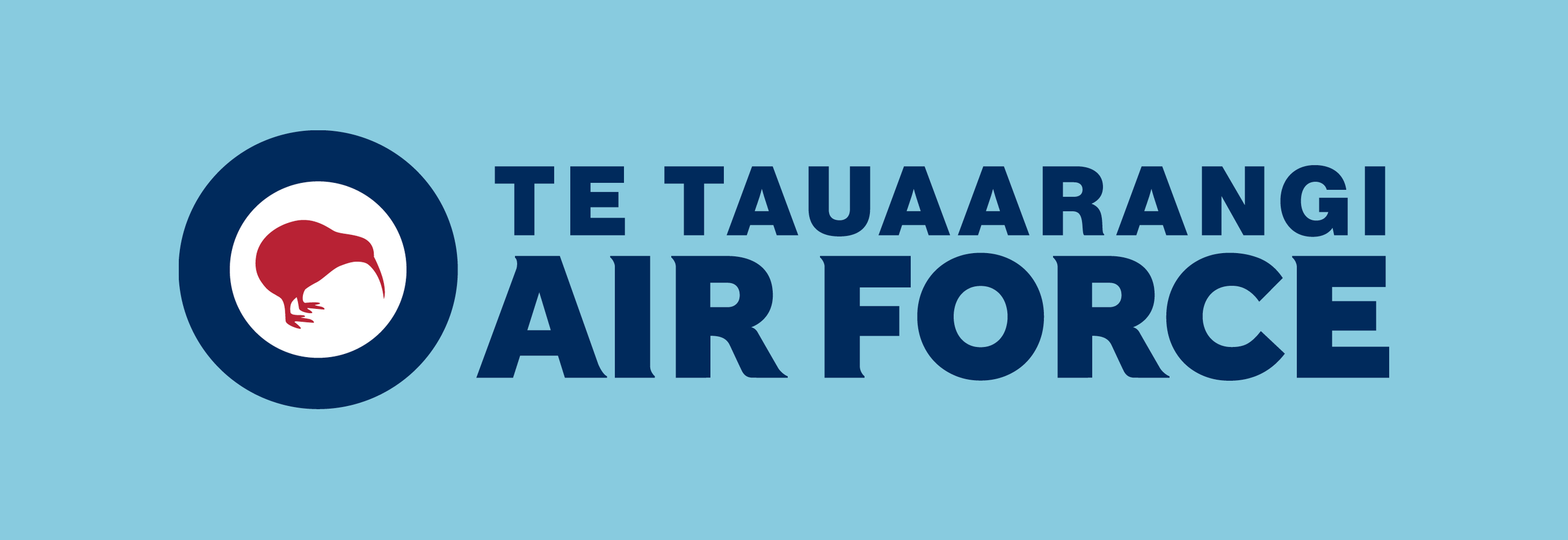
A key achievement was the evolution of the iconic Kiwi logos for both the Air Force and NZDF. Symbols of national pride, service, and commitment.
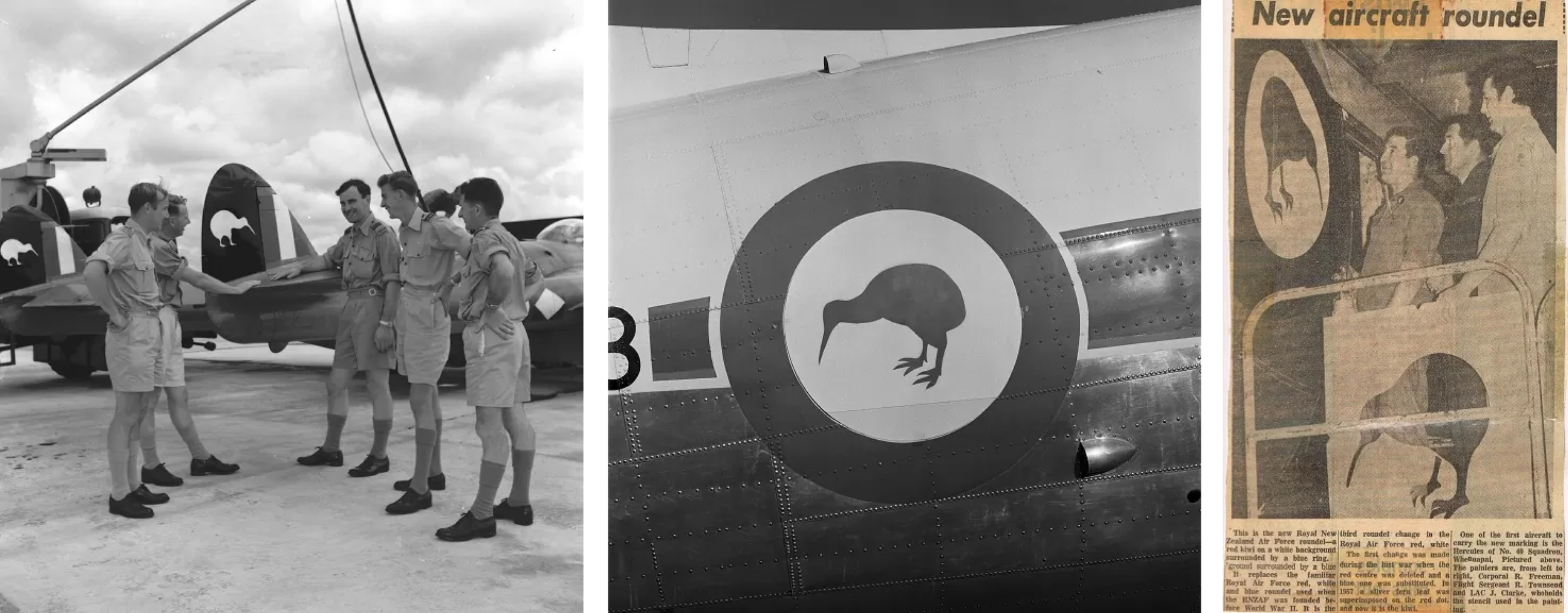
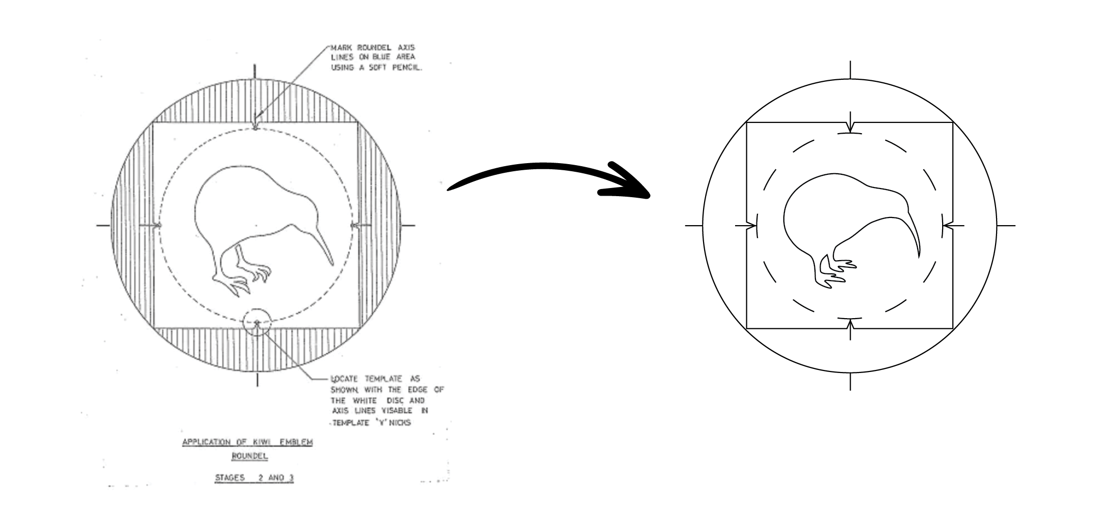
Kiwis have appeared on RNZAF aircraft in various forms since the 1950s, officially becoming the emblem in 1970. For more than five decades, the design remained unchanged. The challenge was to respectfully evolve this enduring symbol to reflect the strength, agility, and modernity of today’s Air Force.
The updated kiwi features a streamlined body and gently curved beak to better align within the roundel, and simplified, straightened feet. These updates enhance the clarity, balance, and visual impact of the symbol across a wide range of applications, from aircraft tails to uniforms.
Design Formula
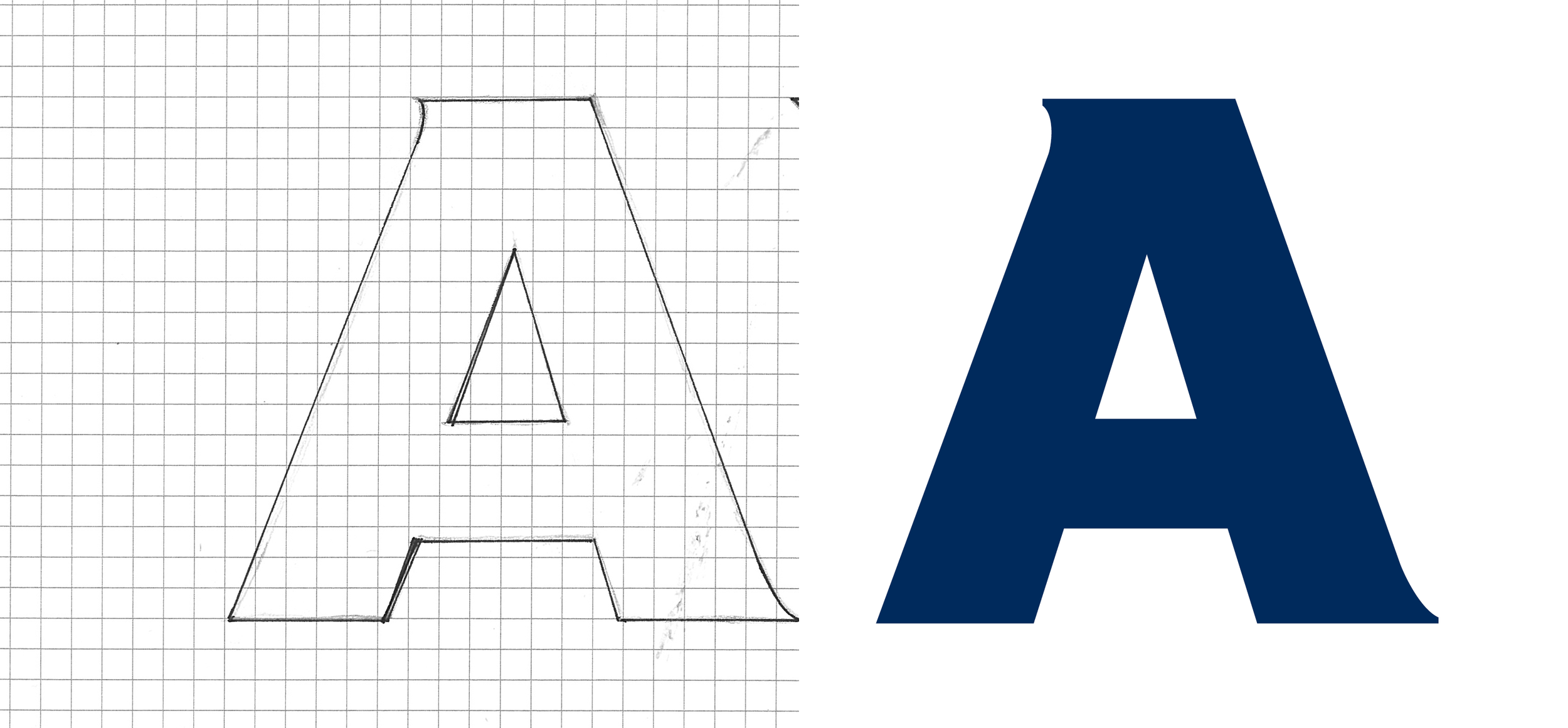
I hand-drew the letterforms for the logotype to ensure a bold and bespoke typographic solution for the AIR FORCE wordmark. This custom approach allowed for precise control over weight, proportion, and spacing, creating a distinctive, contemporary type treatment that complements the evolved kiwi icon. The result is a logotype that feels strong, purposeful, and uniquely aligned with the identity of today’s Air Force.
Creating a Framework
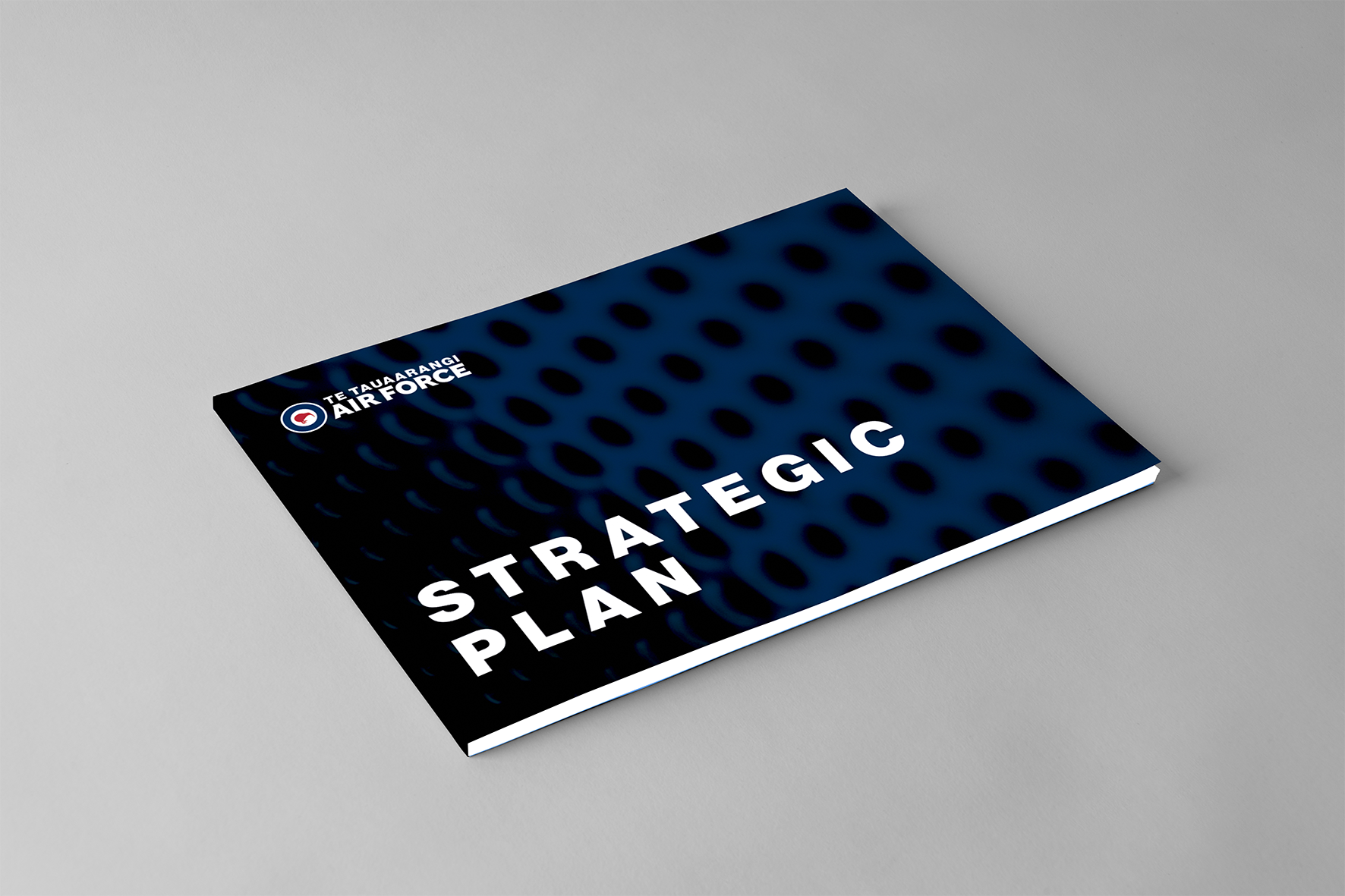
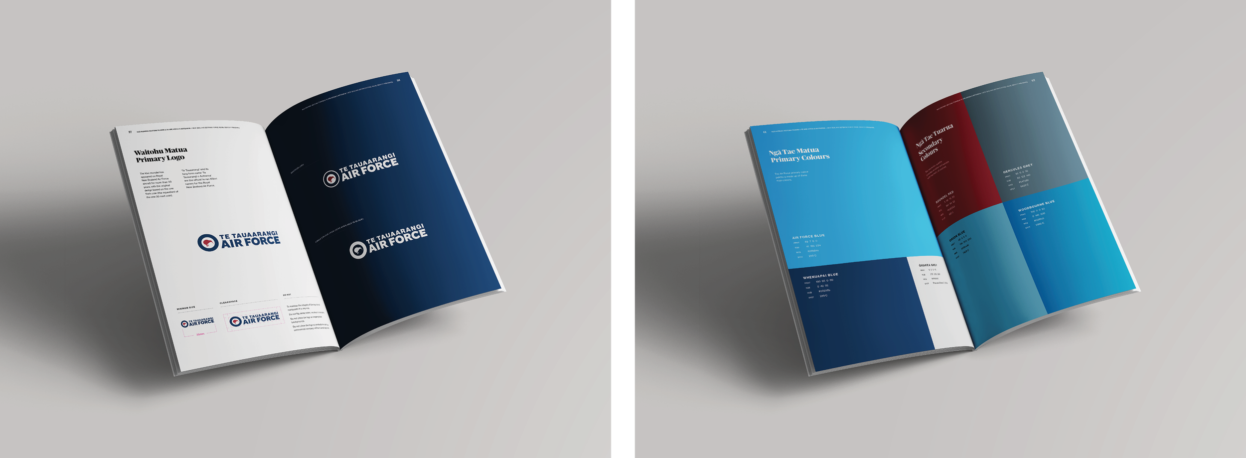
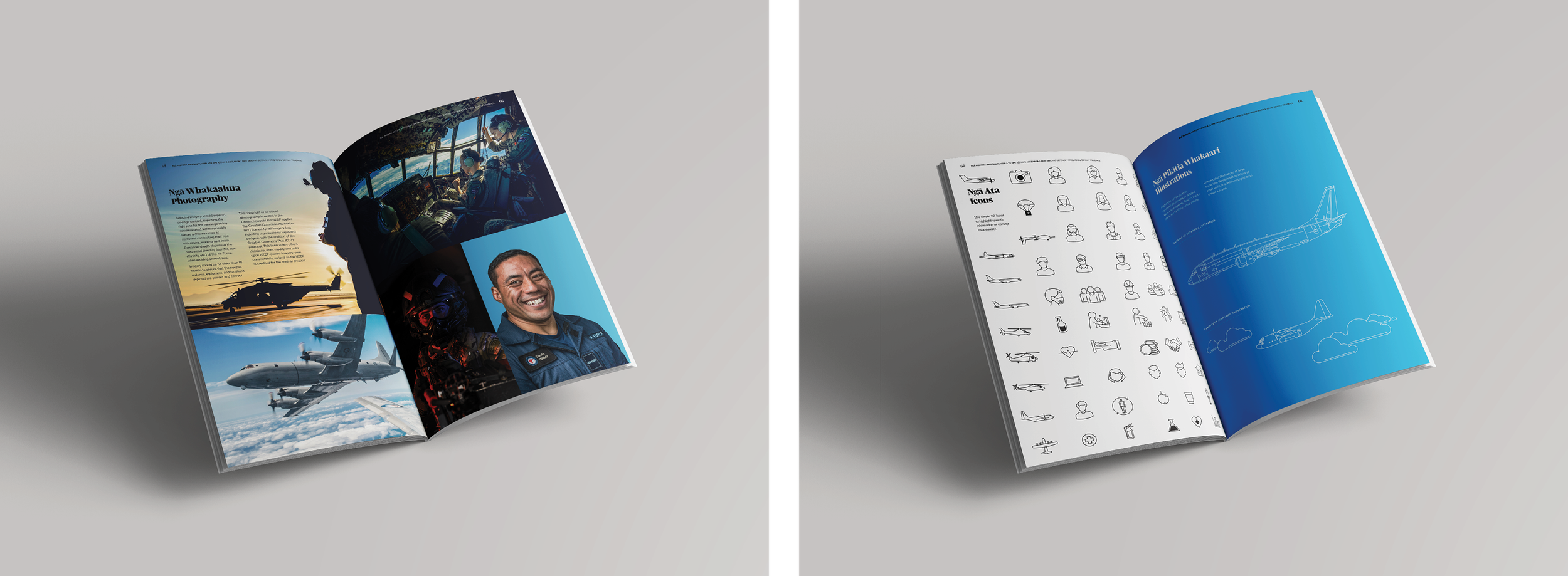
Comprehensive brand guidelines were developed and continuously refined over the years to ensure consistency, clarity, and creative cohesion. These guidelines detail everything from logo usage, colour palettes, and typography, to photography styles, illustration treatments, patterns, sub-brands, and real-world collateral examples. The result is a robust framework that supports both creative flexibility and brand integrity across a wide range of applications.
Results
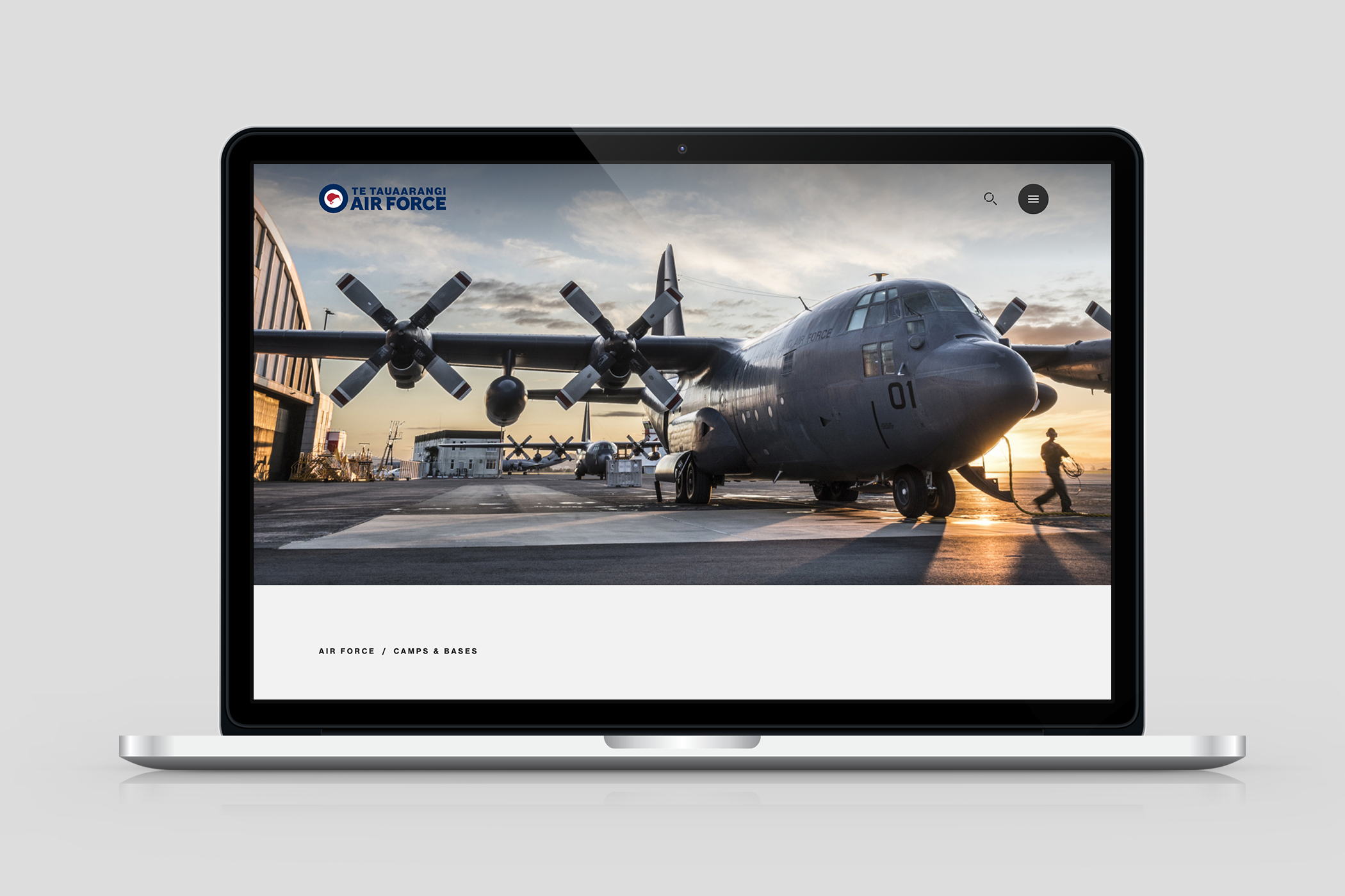
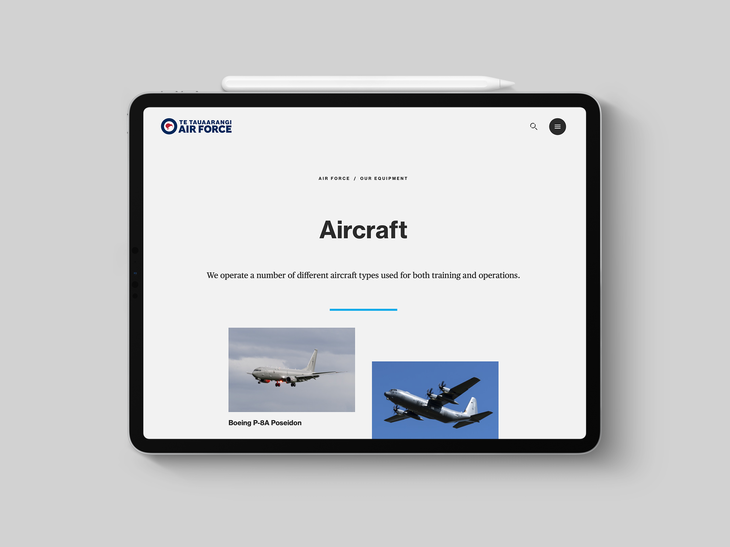
The refreshed Air Force identity has been successfully rolled out across a wide range of applications from aircraft tails and uniforms to digital platforms and official communications, resulting in a stronger, more cohesive brand presence.
The updated Kiwi symbol and custom logotype have enhanced clarity and impact, reinforcing the Air Force’s modern capabilities while honouring its heritage. Supported by clear brand guidelines and standardised templates, the new identity has improved consistency across all materials, streamlining design processes and strengthening visual recognition both within the organisation and in the public eye.